Metal and Finish Direction Review
A jewelry preview can make polished and matte metal look like two different design directions. One view may show a sharp highlight along a shank, while another gives the surface a quieter role beside the stone or setting.
The useful question is not which finish is universally better. It is whether the comparison makes the intended visual hierarchy clear enough for a revision note, while leaving the physical finish as an open question for the jeweler or workshop.
This review focuses on jewelry metal finishes in rings, pendants, earrings, and related concept boards. It separates visible appearance from the metal, process, wear response, maintenance, price, availability, dimensions, and feasibility that still require confirmation.
What the Preview Can Establish
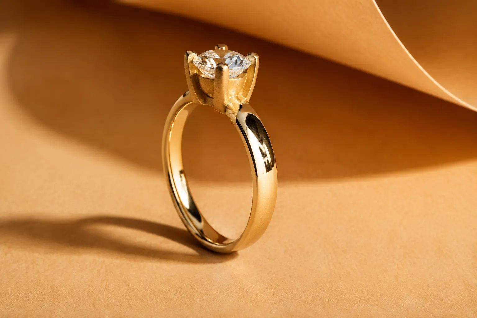
A preview can compare reflected light, texture, contrast, and the apparent hierarchy of a piece. It may show whether the shank reads as a bright band, whether a bezel separates from the stone, or whether a gallery becomes visually quiet.
That evidence belongs to one lighting setup, camera angle, display, and image treatment. It describes the presented appearance; it does not confirm the physical treatment that would produce it.
Review these signals before naming a preferred direction:
- Highlight shape and intensity across curved surfaces
- Sharpness or softness of reflected surroundings
- Visible grain direction on brushed areas
- Surface uniformity across the shank, bezel, gallery, or setting
- Contrast between the metal and the proposed stone
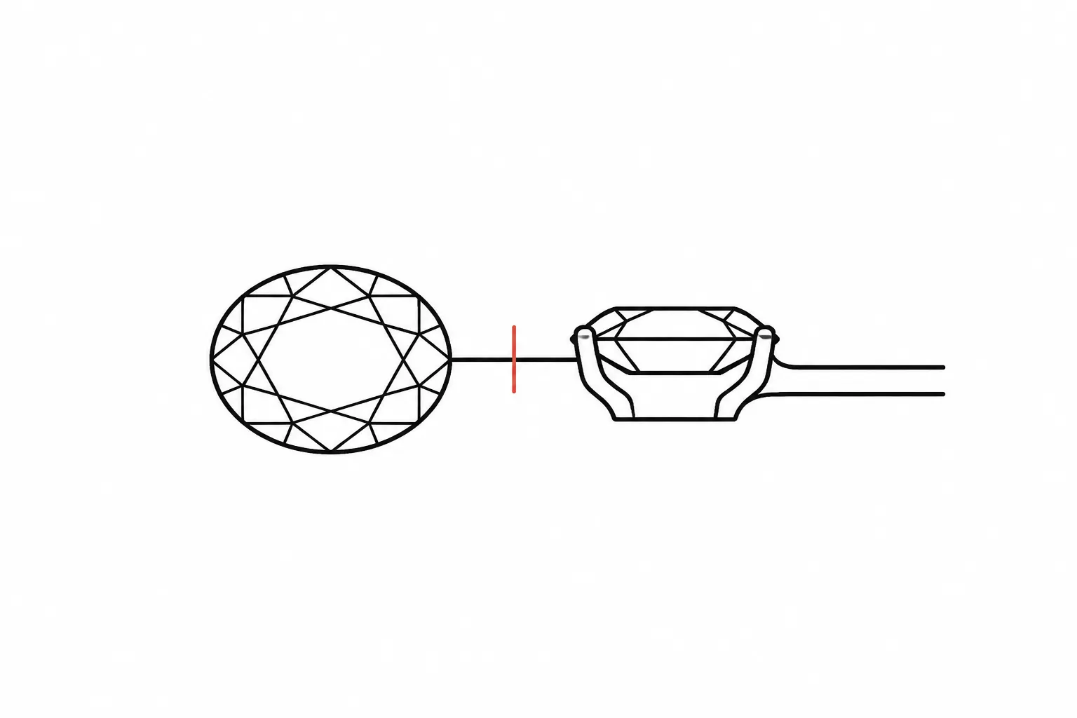
- Legibility of prongs, a bezel, halo, gallery, or under-gallery
- Prominence of marks or simulated scuffs
- Changes in the apparent balance of the silhouette
Record what is visible, what decision it suggests, and who owns the unresolved confirmation.
Comparing Polished and Matte Metal in Jewelry Previews
Polished and matte surfaces create different visual evidence in a concept image. A polished surface is commonly represented with concentrated highlights and a more mirror-like reflection. Surrounding shapes may appear sharper on the metal, and a highlight can trace the profile of a curved ring.
A matte surface is commonly represented with broader, softer, or more diffuse reflection. The environment appears less clearly reflected, so the metal may read as quieter or more uniform. That change can give a stone, prong arrangement, halo, or bezel more visual weight by comparison.
Neither appearance establishes the metal identity or physical process. The workshop still needs to confirm the selected metal, alloy, treatment, accessible areas, and intended production method.
Direct Versus Diffuse Highlights
Direct highlights are narrow and defined. They can make a polished shoulder, claw, rim, or edge easy to notice. Diffuse highlights spread across a wider area and may reduce the separation between adjacent planes.
A polished bezel could outline the stone more clearly in one view, while a matte bezel may merge with the surrounding metal. A matte shank could also keep attention on a brighter setting. The separating criterion is not brightness alone, but whether the finish preserves the hierarchy the concept needs.
Revision note: Keep the setting bright and reflective, but reduce highlight intensity on the shank.
Handoff question: Should the physical finish change between the setting and shank, and can the workshop maintain that contrast across connected surfaces?
Mirror Reflection and Surface Uniformity
A mirror-like reflection can make a preview feel precise, but the result depends heavily on the environment shown in the image. A plain background, bright light source, or carefully placed reflection may exaggerate the apparent clarity of polished metal.
A broad matte or satin area may appear consistent under even lighting, while a brushed area should communicate some direction in its grain. If every surface looks identical, the image may be hiding a finish distinction that affects the design.
Gloss perception involves more than brightness. Reflection sharpness, contrast, haze, surface uniformity, and lighting all influence how a surface is judged. Image reproduction can also change the perceived gloss and roughness of a physical object.
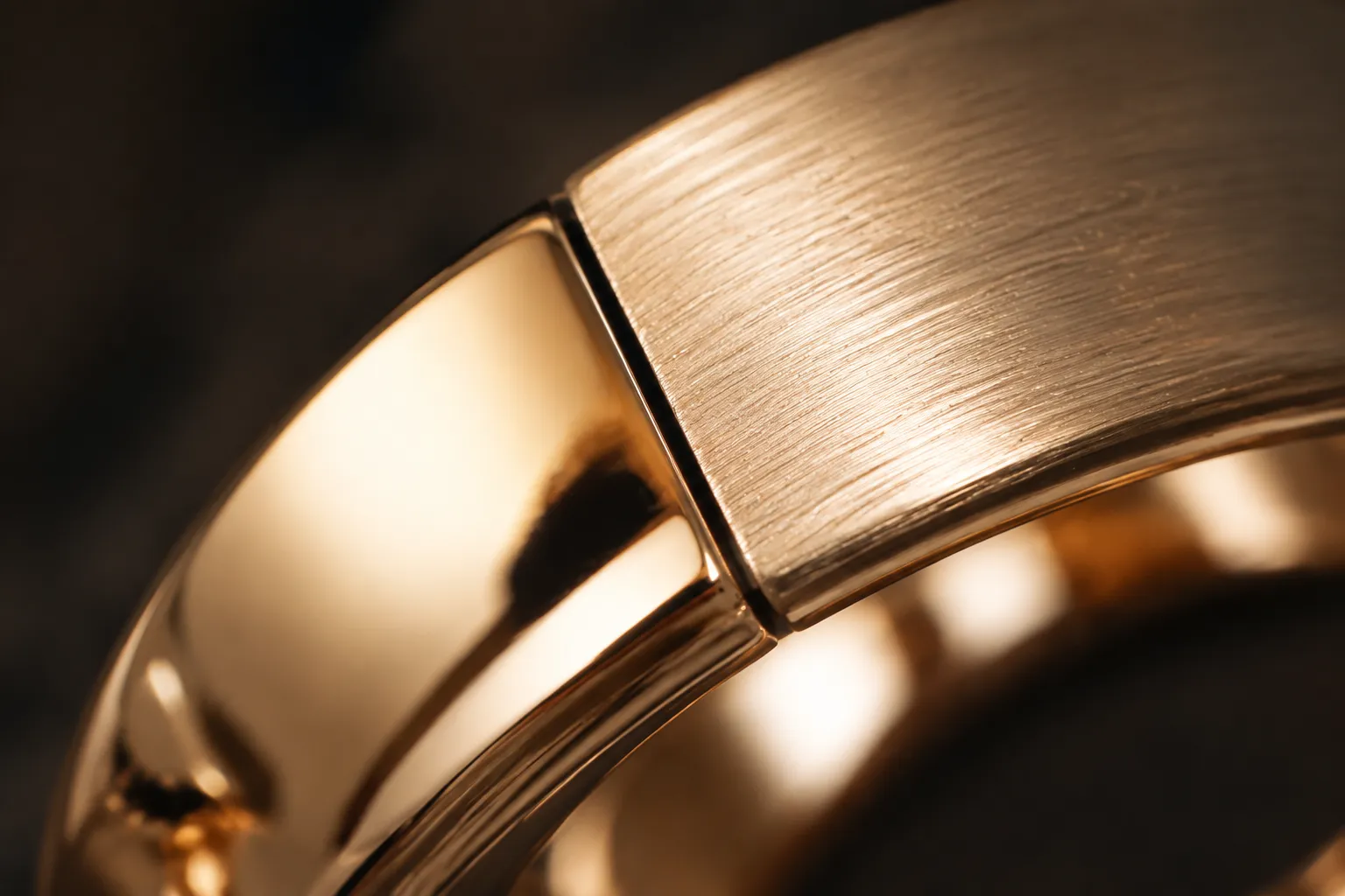
Revision note: Add visible directional grain to the shoulders and retain a separate polished edge around the bezel.
Handoff question: What grain direction and level of uniformity should apply to each surface where planes meet?
How Finish Direction Changes the Setting Read
The same stone shape and setting silhouette can read differently when the surrounding metal changes finish. A polished rim may create a defined boundary around a round, oval, pear, or emerald-cut stone. A matte surface may reduce reflected competition around that boundary.
The effect depends on lighting, color, geometry, and image treatment. Perceived emphasis around the stone is a concept-direction observation, not a conclusion about gemstone performance.
Review the setting through three criteria:
- Stone boundary: Does the metal outline clarify or soften the stone shape?
- Structural detail: Do the prongs, bezel, halo, gallery, or under-gallery remain visible?
- Visual hierarchy: Does the finish make the stone, setting, shank, or decorative texture appear dominant?
A bright polished bezel against a quieter shank could make the stone boundary more explicit. A fully matte setting could also separate the stone from the metal, but only if the view retains enough contrast to make that relationship readable.
Revision note: Use a quieter finish on the gallery so the side view keeps the stone profile visible.
Handoff question: Which setting surfaces should remain polished for edge definition, and which can receive the proposed matte or textured treatment?
Matte, Brushed, and Satin Are Not Automatically the Same
Consumer and seller language often overlaps. Terms such as matte, brushed, satin, high polish, and hammered may function as broad visual labels rather than precise process descriptions.
For preview work, use these terms as direction markers first:
| Term | Visual direction | Open question |
|---|---|---|
| Matte | Low-shine or non-reflective appearance with softened highlights | What physical treatment and surface response does the workshop intend? |
| Brushed | Fine repeated lines or grain with a visible direction | Which direction should the grain follow across connected surfaces? |
| Satin | Softer, more uniform glow that may sit visually between polished and matte | Is the requested surface directional or non-directional? |
| Hammered | Irregular highlight breaks from visible beaten or dimpled variation | What texture scale and placement can the process reproduce? |
| Sandblasted | Frosted or textured appearance associated with abrasive media | Can the selected treatment reach the intended recessed areas? |
| Bead-blasted | Softened, textured appearance associated with blasting media | How should the resulting texture and edge definition be described? |
These labels should not become interchangeable technical instructions. Exact process, media, surface access, and intended result belong in the production handoff.
Brushed and Satin Finishes
A brushed preview should communicate direction. If the lines run along the shank in one view and across it in another, the object may appear inconsistent even when the geometry is unchanged.
A satin preview may look more uniform and less directional. That can support a broad, quiet surface treatment, but it may remove useful scale cues when the image lacks edge highlights.
Revision note: Keep the satin direction visually even across the pendant face, but preserve a narrow polished border.
Handoff question: Is the requested surface directional brushed, non-directional satin, or another workshop-defined treatment?
Hammered, Sandblasted, and Bead-Blasted Finishes
These finishes introduce texture that may become part of the silhouette and visual identity. Hammered areas can create irregular highlight breaks. Sandblasted or bead-blasted areas may appear more evenly frosted, depending on the simulated grain and lighting.
The preview can compare texture density and placement. It cannot establish final depth, surface roughness, media size, or coverage in recessed areas.
A textured appearance in the render may imply coverage that the physical process cannot reproduce uniformly. Surface access matters where galleries, narrow channels, edges, or other detailed areas limit the available working space.
Revision note: Reduce the texture scale on the gallery and keep the outer edge visually smoother.
Handoff question: Can the proposed process reach the recessed details without changing edge definition or surface detail?
Fingerprint and Simulated Scuff Visibility
Fingerprint visibility and simulated scuff visibility are useful review criteria because they describe what the image emphasizes. They do not establish how a physical piece will perform.
A polished preview may show concentrated reflections that make a small mark more noticeable. A textured preview may break up the reflection and make the same simulated mark less prominent. That is an appearance hypothesis, not evidence of scratch response, finish life, or maintenance needs.
Lighting can reverse the impression. Directional light may reveal texture strongly, while even light may make the same texture appear nearly flat. Screen quality, compression, camera distance, and background contrast also affect what the viewer notices.
Use precise records:
- The simulated scuff is more visible in the polished view.
- The textured view makes the mark less prominent at this angle.
- The comparison does not establish physical wear response.
- The workshop must confirm refinishing context and maintenance expectations for the specific piece.
Revision note: Show both finish options under the same lighting and include one close view of the shoulder.
Handoff question: What maintenance or refinishing expectations should accompany this finish choice?
A Practical Review Workflow
1. Lock the Variables That Remain Assumptions
Record the proposed metal color, stone shape, setting silhouette, dimensions, and lighting setup as assumptions unless they come from a confirmed source record. A finish comparison should not quietly become a decision about alloy, stone identity, price, availability, or construction.
2. Compare Matching Views
Use matching front, profile, three-quarter, and detail views where possible. A polished view with a brighter background cannot be compared fairly with a matte view under flat illumination.
Keep the stone, geometry, camera angle, background, and lighting stable when the purpose is to isolate finish direction. Otherwise, the reader may attribute the difference to the wrong variable.
3. Mark the Visible Difference
Use labels tied to the image:
- Sharper highlight along the outer shank
- Softer reflection on the pendant face
- Stronger contrast around the bezel
- Directional grain visible on the band
- Hammered texture interrupting the edge reflection
- Gallery detail less distinct in the matte view
- Simulated scuff more noticeable in the polished view
Labels such as “better quality,” “more durable,” or “more practical” require evidence beyond the preview and should not be treated as visual findings.
4. Turn Preference Into a Revision Note
A useful note names the surface, the direction, and the intended visual consequence.
Weak: Make it more modern.
Stronger: Keep the outer shank matte, retain a polished line at the shoulder, and preserve the stone boundary in the three-quarter view.
The stronger note gives a designer, client, CAD specialist, jeweler, or workshop a defined change to review.
5. Assign the Confirmation Owner
The person preparing the preview can record the concept direction. A source record can document supplied material or terminology. The jeweler or workshop must confirm the physical process, accessible areas, maintenance expectations, refinishing context, and feasibility.
The preview remains a decision artifact, not a final production document.
A Worked Comparison
Imagine a hypothetical ring preview with a central oval stone, a narrow halo, and a plain shank. The metal color is an assumption, and both versions use identical geometry.
The polished version shows a bright line along the shoulders and clearer reflected surroundings around the halo. The matte version shows softer highlights and makes the central stone appear more visually isolated.
The supported observation is narrow: the polished view gives the metal stronger reflected definition, while the matte view reduces that definition and changes the apparent contrast around the setting. Neither view establishes physical wear response, stone performance, or production feasibility.
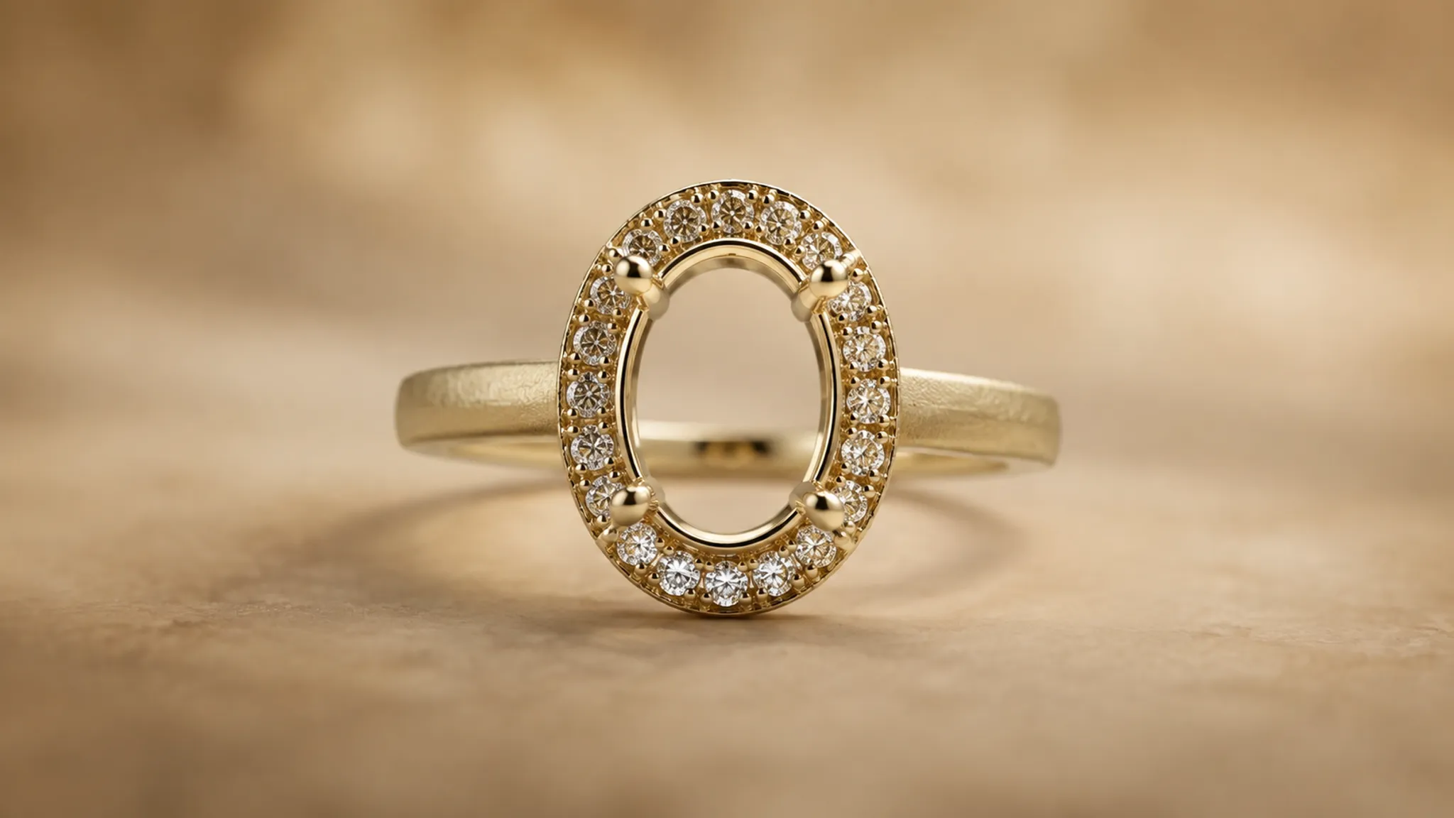
Revision note: Use the matte direction on the shank for a quieter band, but keep the halo rim and selected edge surfaces polished so the oval outline remains legible.
Handoff question: Can the workshop apply contrasting finishes to the shank, halo rim, and edge surfaces while preserving the intended boundaries?
Assumptions to Keep Beside the Preview
A finish review should keep unresolved specifications visible. This register prevents a convincing image from carrying details it was never designed to establish.
| Item | Preview status | Confirmation owner |
|---|---|---|
| Metal type or alloy | Proposed or unspecified | Jeweler or supplier |
| Finish name | Visual direction only | Jeweler or workshop |
| Exact process or media | Not established by the image | Workshop |
| Grain direction | May be suggested by the view | Workshop |
| Surface coverage in recesses | Not confirmed | Workshop |
| Dimensions and scale | Concept cues unless recorded | Designer and CAD specialist |
| Stone identity and availability | Not established by the render | Supplier or jeweler |
| Wear and refinishing response | Unresolved | Qualified workshop |
| Price and availability | Outside the preview's evidence | Jeweler or supplier |
| Production feasibility | Not established | CAD specialist and workshop |
| Approval status | Must be recorded separately | Project owner |
Common Misreadings
“Matte means fewer scratches.”
A matte preview may make a simulated mark less prominent because the surface breaks up reflected light. That does not establish hardness, scratch frequency, or longer finish life.
“High polish is always the wrong choice for daily wear.”
A polished appearance may show reflections and marks more clearly in one image. It does not establish suitability for a particular use or a fixed maintenance schedule.
“Satin and brushed are identical.”
The terms may overlap in consumer language, but a directional brushed appearance and a more uniform satin appearance communicate different visual information. Ask the workshop which process and surface direction the chosen term represents.
“A matte render confirms a matte physical finish.”
It confirms only that the image has been presented with a matte visual direction. Lighting, roughness settings, image reproduction, and display conditions can alter the result.
“Finish alone determines the stone's sparkle.”
Contrast and reflection can change the apparent relationship between metal and stone. The preview does not establish how a stone will perform across lighting conditions.
When the Preview Needs Another Pass
Request a revised comparison when:
- The two finish options use different lighting or backgrounds
- Brushed grain changes direction without explanation
- Matte, satin, and brushed labels are used interchangeably
- The setting becomes unclear in one view
- The render implies texture in areas too small to inspect
- The metal color changes with the finish comparison
- A simulated scuff is presented as evidence of physical wear
- The image does not identify whether the view is conceptual or approved
- The revision note cannot identify a specific surface
- No confirmation question is assigned to the jeweler or workshop
A second pass should answer one unresolved visual question at a time. More realism is not automatically more useful when the finish direction remains unnamed.
FAQ
What are the main jewelry metal finishes to compare in a preview?
Start with polished and matte because they create a clear difference in reflected light. Add brushed, satin, hammered, sandblasted, or bead-blasted when texture direction, uniformity, or setting clarity changes the decision.
How should polished versus matte metal be labeled?
Label polished as a bright, reflective concept direction and matte as a softer, more diffuse direction. Treat both as visual descriptions unless a source record or workshop defines the physical process.
Can a preview show mirror reflection accurately?
It can suggest mirror-like reflection through sharp highlights and reflected surroundings. Display conditions and image reproduction can alter perceived gloss, so the physical result still requires confirmation.
Should a ring use one finish everywhere?
That is a design-direction choice, not a universal rule. Compare whether one finish supports the silhouette or whether contrast between the shank, setting, bezel, or gallery improves legibility. The workshop must confirm whether the proposed combination can be applied as intended.
Does a textured finish hide visible wear?
Texture may make some marks less prominent in a particular view. That observation does not establish wear response, scratch frequency, durability, or finish longevity.
What belongs in the physical finish confirmation?
Include the selected visual direction, named surfaces, matching comparison views, metal and stone assumptions, finish terminology, proposed grain direction, unresolved process questions, and confirmation owner. Keep approval status separate from the render.
The Decision to Carry Forward
Choose the finish direction that communicates the intended hierarchy, then record exactly what the preview shows.
- Visible preference: The polished edge gives the bezel clearer separation.
- Revision instruction: Keep the bezel edge polished and the shank matte.
- Confirmation question: Can the workshop produce this contrast across the specified surfaces?
That structure keeps jewelry metal finishes in their proper role. The preview compares a visual direction, the source record preserves supplied material information, and the responsible jeweler, CAD specialist, supplier, or workshop confirms what the image cannot establish.
Sources
- The Importance of Metal Finishes and Surface Treatments ...
- Perceptual Modeling and Reproduction of Gloss
- The Precious Project: Polishing and Finishing of Additive Manufacturing (AM) Jewelry
- Visually Significant Dimensions and Parameters for Gloss
- Analysis of Physical Features Affecting Glossiness and Roughness Alteration in Image Reproduction and Image Features for Their Recovery