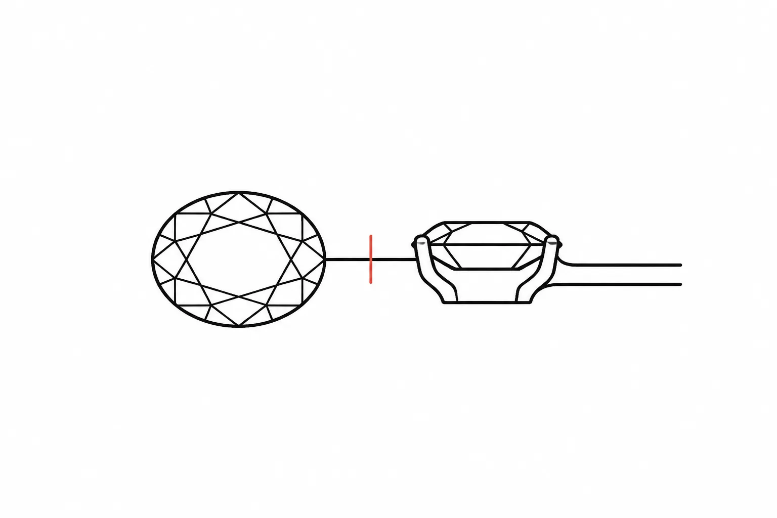
Translate Delicate, Bold, Vintage, and Minimal Into Jewelry Design Cues
Use delicate, bold, vintage, and minimal as direction labels, then translate each one into visible jewelry design cues. Check the silhouette, scale, line weight, ornament density, setting, stone shape, metal contrast, finish, and proportion.
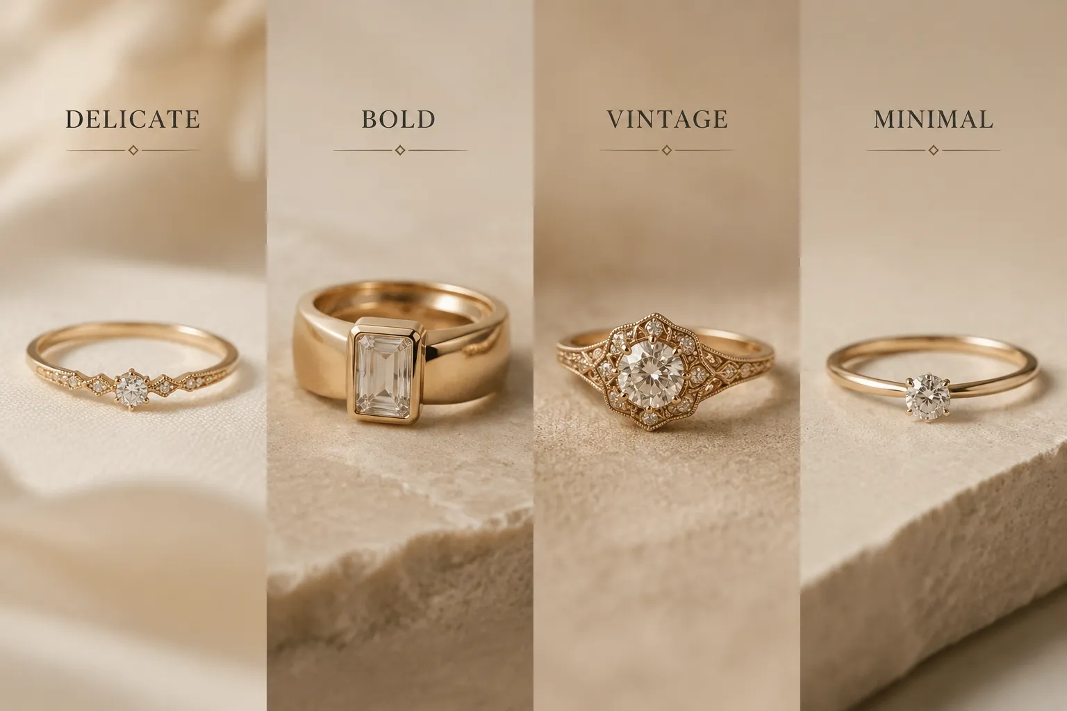
A preview can show the intended visual direction. It cannot establish the stone, metal composition, exact dimensions, durability, price, availability, fit, or production feasibility. Keep those details in the source record, technical drawing, quotation, CAD review, or workshop confirmation.
Turn Style Words Into Visible Cues
Start by separating the preference word from the feature that creates its effect.
| Style label | Possible visible cues | Detail still requiring confirmation |
|---|---|---|
| Delicate | Fine-looking lines, restrained scale, open spacing, small visual mass, or a narrow shank | Whether the proposed thickness, connection, setting, and scale suit the intended use |
| Bold | Strong silhouette, larger visual mass, wider bands, high contrast, dense ornament, or a dominant stone shape | Which feature creates the emphasis and whether the structure can support the intended form |
| Vintage | Period-associated motifs, detailed surface treatment, softened proportion, or a historically referenced silhouette | Which period or source is intended, and whether the reference is visual direction only |
| Minimal | Few visible elements, clear geometry, low ornament density, restrained contrast, or emphasis on proportion | Whether the reduced form still communicates the intended stone, setting, profile, and finish |
These are editorial translations, not fixed definitions. The same ring could appear delicate because of its narrow silhouette, bold because of a large central stone, vintage because of its surface pattern, and minimal because it avoids surrounding ornament.
The useful question is not “Which label is correct?” Ask instead: Which visible feature should the maker preserve?
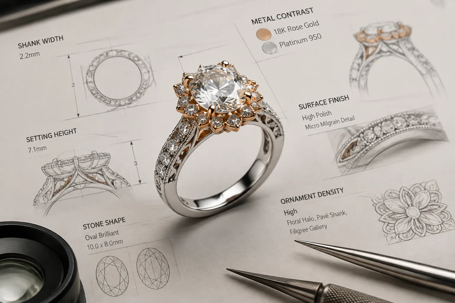
Delicate: Check Visual Weight
A delicate direction usually requires a decision about visual weight, not simply a smaller size. Inspect the apparent width of the shank, the spacing between stones or decorative elements, the metal surrounding the stone, and the height of the setting.
Also compare the openness of the gallery or underside with the contrast between the central feature and surrounding details. A narrow band with a low-contrast finish may read as delicate. The same band with a large, high-contrast stone may appear more pronounced.
Use a revision note such as:
Keep the open spacing and fine-looking outline. Reduce the visual mass around the setting, but record the proposed band width, setting height, and connection points for technical review.
The preview suggests appearance only. A jeweler or CAD specialist still needs to confirm dimensions, thickness, support, and fit requirements.
Bold: Identify the Source of Emphasis
Bold does not always mean large. It can come from a strong outline, concentrated contrast, an unusual stone shape, a broad surface, or repeated forms that create visual rhythm.
Compare two possible directions:
- Scale-led boldness: a wider shank, larger profile, or dominant center element.
- Contrast-led boldness: a simpler form with strong metal contrast, a sharp outline, or a concentrated color difference.
Name the criterion before choosing. If the piece should remain forceful from a distance, scale and silhouette may matter most. If it should feel graphic at close range, contrast, edges, and surface finish may carry more of the effect.
Record the repeated element when one drives the style: a stepped outline, broad bezel, clustered stone arrangement, heavy-looking clasp, or repeated geometric unit. Then ask:
Is the intended emphasis created by width, height, contrast, stone shape, ornament density, or a combination of these cues?
Do not let the render answer that question by implication. Assign it to the person preparing the technical interpretation.
Vintage: Define the Reference
“Vintage” is especially open to interpretation. It may describe a period reference, an older-looking surface, a repeated motif, a softened proportion, or a market-facing visual impression. It does not establish age, origin, provenance, or historical authenticity.
Make the direction more specific by identifying:
- The silhouette or outline being referenced.
- The period-associated motif, if one is intended.
- The type of repetition in the ornament.
- The edge treatment and surface finish.
- The relationship between the center element and surrounding details.
- Whether the design is new work with historical influence.
A preview with engraved-looking detail may suggest a vintage direction, but it does not establish how that detail will be made or what historical source it represents. Record reference images, publication rights, permission records, or rights-holder communication in the source record. Attribution alone does not settle reuse permission.
Use this handoff wording:
Treat the historical reference as visual direction only. Record the intended period or source, identify the repeated motif, and ask the designer or rights holder to confirm how the reference may be used.
If no specific period is intended, replace “vintage” with observable terms such as “low-contrast surface detail,” “symmetrical ornament,” “softened edge,” or “repeated floral-like motif.” These cues are easier to compare and revise.
Minimal: Check What Remains
Minimal design is not simply an absence of decoration. It depends on proportion, spacing, edge quality, surface treatment, and the relationship between the few elements that remain.
Inspect the number of visible components, the amount of open space, the clarity of the main silhouette, the visibility of the setting, and the consistency of the metal surface. Check whether the clasp, gallery, or underside follows the same restraint.
A plain outline can still look busy when several finishes, edges, or contrasting elements compete. Conversely, one strong stone shape may remain minimal when its surrounding structure is quiet and proportionate.
Choose between two directions:
- Form-led minimal: let the outline, profile, and negative space carry the design.
- Material-led minimal: keep the form restrained while using surface finish or metal contrast for distinction.
Record which direction controls the concept. A technical drawing can then clarify proportions, thickness, depth, connections, materials, and finish.
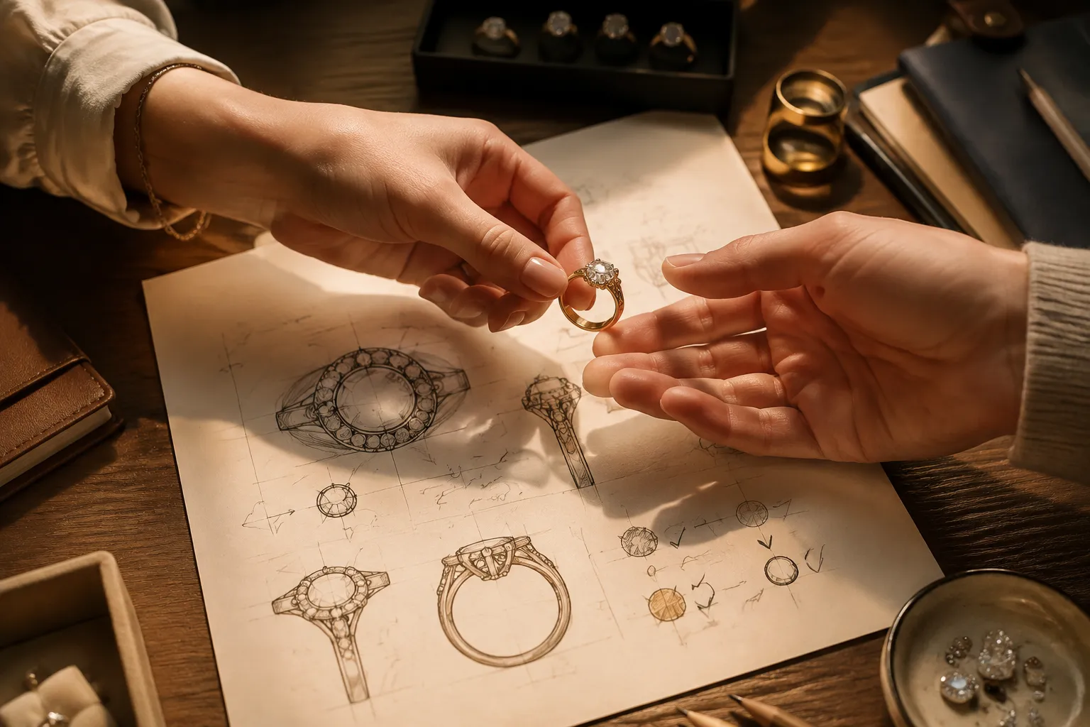
Compare the Four Labels by Visible Evidence
Use the labels as a comparison board, then replace them with decisions.
| Question | Delicate | Bold | Vintage | Minimal |
|---|---|---|---|---|
| What catches attention first? | Fine line or small visual mass | Scale, contrast, or dominant silhouette | Repeated motif or period-associated detail | Proportion and clean form |
| Where can ambiguity cause trouble? | Thickness, support, and setting scale | Structural demands and visual overload | Historical reference and rights records | Underside details and surface consistency |
| What should the preview label? | Apparent scale and line weight | Intended emphasis | Visual reference and source record | Main form and finish direction |
| Who confirms the next detail? | Jeweler or CAD specialist | Jeweler, CAD specialist, or workshop | Designer, rights holder, or source owner | CAD specialist or workshop |
A style word describes the desired reading. The handoff must describe the visible cause.
Prepare the Handoff in Two Stages
A concept drawing and a technical drawing serve different purposes. Conceptual imagery can communicate proposed proportion, general scale, surface direction, and viewing context. Technical documentation needs clearer information about dimensions, thickness, depth, materialization, and connections.
Concept Direction
- Preferred style label.
- Observable cues that support it.
- One or two reference views.
- Elements that remain hypothetical.
- Approval status for the visual direction.
Technical Follow-up
- Proposed dimensions and tolerances.
- Stone shape and setting details.
- Metal and finish information.
- Connection, clasp, gallery, or shank requirements.
- Questions about fit, durability, availability, quotation, or feasibility.
- A named owner for each unresolved item.
The preview shows the intended appearance. The technical record determines what must be checked next.
Example: Turn One Brief Into a Reviewable Note
A client says, “I want a delicate vintage ring, but not something ornate.” That sentence contains several unresolved choices. Translate it into a compact brief:
Use a fine-looking silhouette with restrained visual mass. Include one repeated period-associated detail on the shoulder or gallery, but keep the surrounding surface open. Compare a low-contrast finish with a cleaner polished finish. Treat the stone, metal, dimensions, and setting as assumptions until the source record and workshop review confirm them. Ask the jeweler or CAD specialist to show the side profile and underside before approval.
This note gives the team something observable to compare. It also prevents “vintage” from silently adding dense ornament and prevents “delicate” from being treated as confirmed thickness.
Questions Before Approval
- Which visible feature creates the chosen style impression?
- Is the intended effect driven by silhouette, scale, setting, stone shape, finish, contrast, ornament density, or a combination?
- Which elements are observed in the preview, and which are hypothetical assumptions?
- Does the side view support the same reading as the front view?
- What dimensions, materials, and connections still need to be recorded?
- Does “vintage” refer to a specific source, a period influence, or only a surface impression?
- Are reference images accompanied by a source record and permission status?
- Which unresolved question belongs to the jeweler, CAD specialist, supplier, rights holder, or workshop?
Final Check
Replace every broad style word with at least two visible cues and one confirmation question.
“Delicate” could become fine-looking line weight plus open spacing. “Bold” could become a broad silhouette plus strong contrast. “Vintage” could become a named visual reference plus repeated ornament. “Minimal” could become low ornament density plus controlled proportion.
That translation makes the concept easier to review without treating the image as a production fact. The next handoff should label the unresolved detail, attach the relevant source or technical record, and name the person responsible for confirmation.
Sources
- A Shape Grammars Approach to Bvlgari’s Emerald Necklaces Design Language
- What the Jeweller’s Hand Tells the Jeweller’s Brain: Tool Use, Creativity and Embodied Cognition
- A multimodal social semiotic approach to jewellery design pedagogy
- From Image to Imagination: Exploring the Impact of Generative AI on Cultural Translation in Jewelry Design